Challenge.
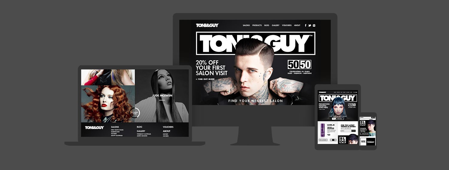
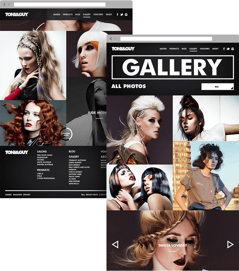
Toni & Guy asked us to create a standout website to unify 52 of their salons. As a leading fashion brand, beautiful design was key. But just as importantly, it needed to function elegantly for both customers and salon staff.
Approach.
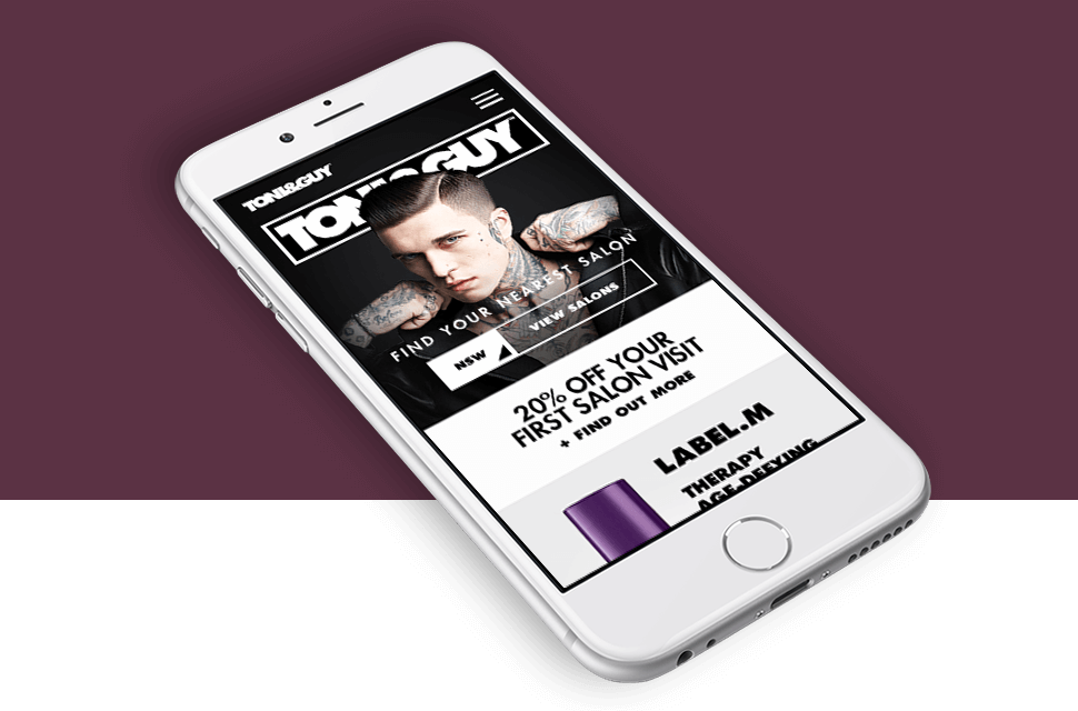
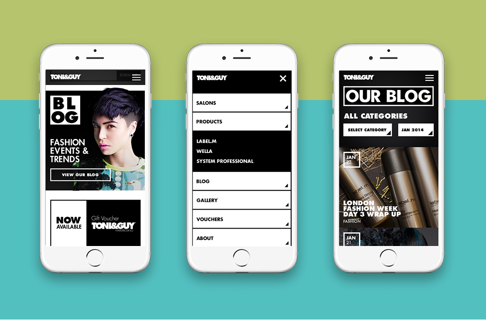
Our research showed Toni & Guy had a high bounce rate from their old mobile site. So we championed a responsive design that delivered beautiful experiences on every device.
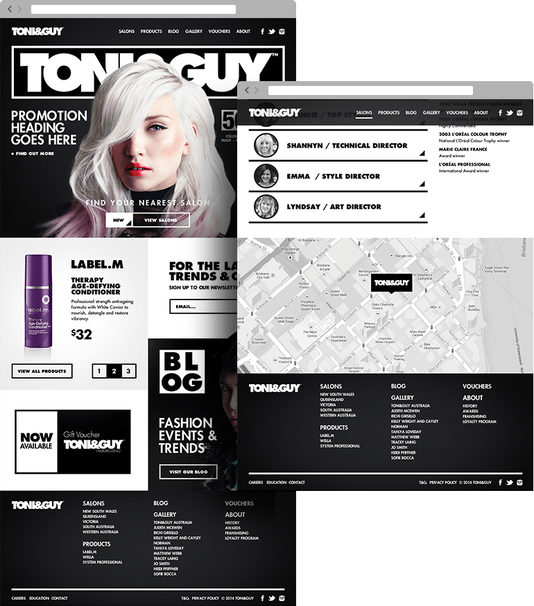
To drive more customers from site to salon, we designed an uncluttered layout that put key information at visitors’ fingertips. We also created a template that allowed each salon to present themselves with clarity and panache.
Results.
The new fully responsive website received a 9% increase in mobile visitors within the first year. Bounce rates decreased by 20% and time spent on the site increased by 25%.

